Decorating with Color Theory Art
The great Vincent van Gogh once said, “What color is in a picture, enthusiasm is in life.” And we couldn’t agree more! Color lights up our everyday lives, whether it’s a fresh bouquet of vibrant florals or a chic monochromatic scarf. In interior design, how we use colors is as much an art as it is a science. This is what we call “color theory.” Keep reading to explore the basics of interior color theory and how to use them in your space.
What is the color theory in interior design?
No matter the interior style, a good design has two things: balance and harmony. Ever noticed when a room just feels off, but you can’t put your finger on it? Odds are the space has too much of one element and not enough of another to make it feel unified! These are the golden rules we follow when it comes to color and home design.
- The rule of 3: Select three colors that are next to each other on the color wheel (e.g., blue-green, green, and yellow).
- The 60-30-10 rule: 60% = dominant color; 30% = secondary color; and 10% = an accent color.
- The 3-5-7 rule: In general, using an odd number of colors (or objects) is a magical trick for creating visual depth and appeal.

What is the psychology of colors in interior design?
There’s a science to why different colors make us feel a certain way. Color psychology explains how hues influence perceptions and behaviors. While certain colors can have unique meanings based on our personal history or taste, here are the commonly accepted signifiers in interior design:
- Red makes us feel passionate and strong. It’s best used in gathering spaces where there’s a lot of energy (think: the dining or living room).
- Blue and violet invite feelings of calm. We love using these hues in the serene places of the home like the study/reading room and bathroom.
- Green is the color of freshness and nature. It complements blue in rooms that we want to feel at peace in.
- Yellow and orange make us feel optimistic. Add one or both colors to the kitchen or your home office to inspire you!
- Pink is a youthful color that’s playful and uplifting. Go all in with it or use it as an accent color to balance out soft greens and pale blues.
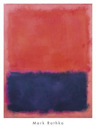
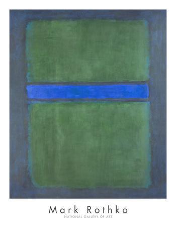
Having a basic understanding of color theory in interior design makes decorating that much easier, and we love applying the principles with artwork. Art can quickly create or change the mood of a space. Choose pieces inspired by the psychology of color, such as the color field paintings of Mark Rothko, or curate ones that highlight your favorite shades. Ready to get started? Shop and explore art by color on Art.com!

